New York City Subway
Design the next decision.
A brand system becomes useful when someone else can extend it. New York’s subway signs show what happens when design starts taking responsibility for the next decision.
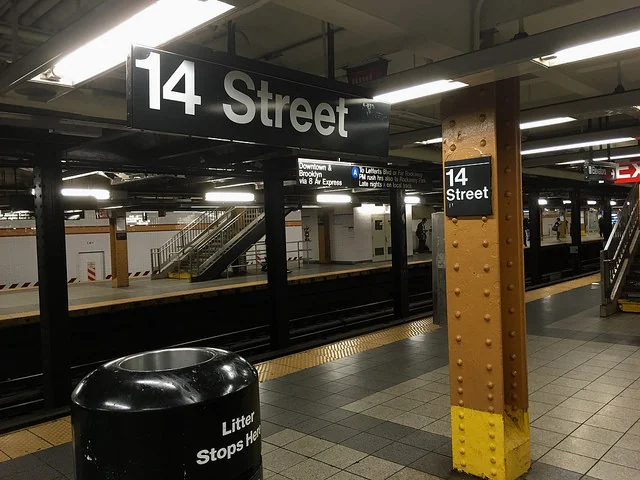
You are late. The platform is busy. A staircase appears on the left and a sign hangs ahead. In that moment, the design has a very specific job. It has to help you decide where to go.
Nobody should need to admire the typography before understanding the direction. Yet the consistency of the typography, arrows, spacing, and route markers is part of what makes the decision possible. The system works by making the next encounter feel familiar.
This is a useful place to think about identity. Away from the launch poster. Inside an ordinary decision, made under pressure, by someone who has other things on their mind.
A unified network needed a shared language
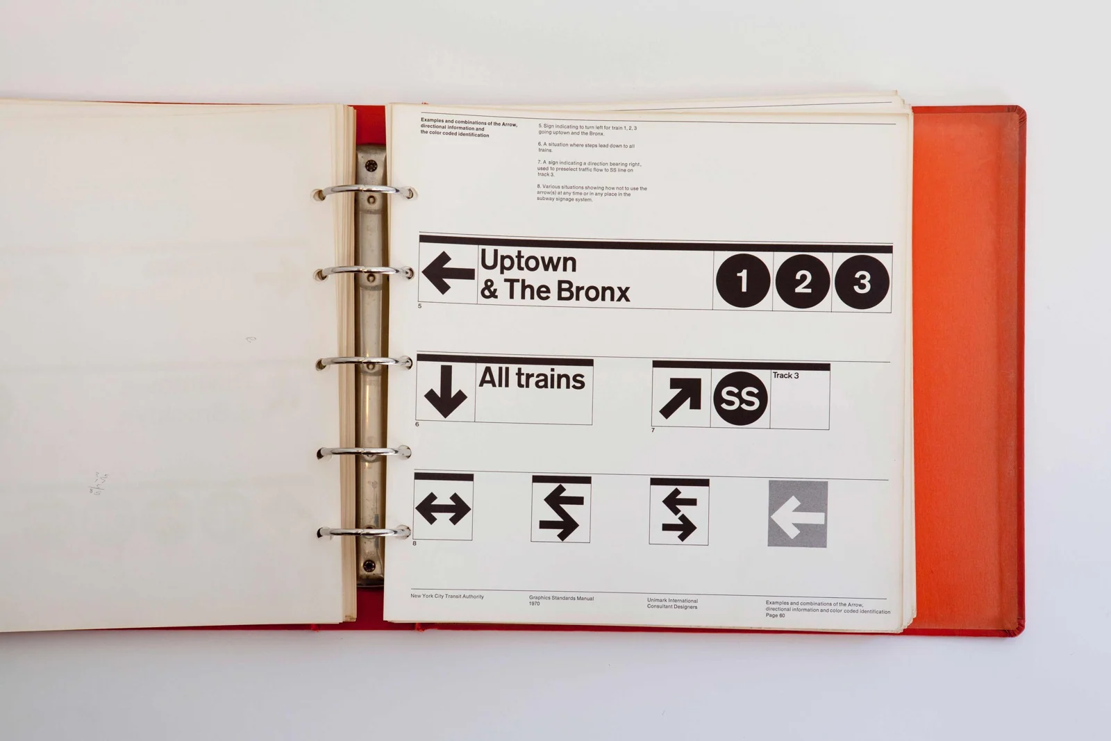
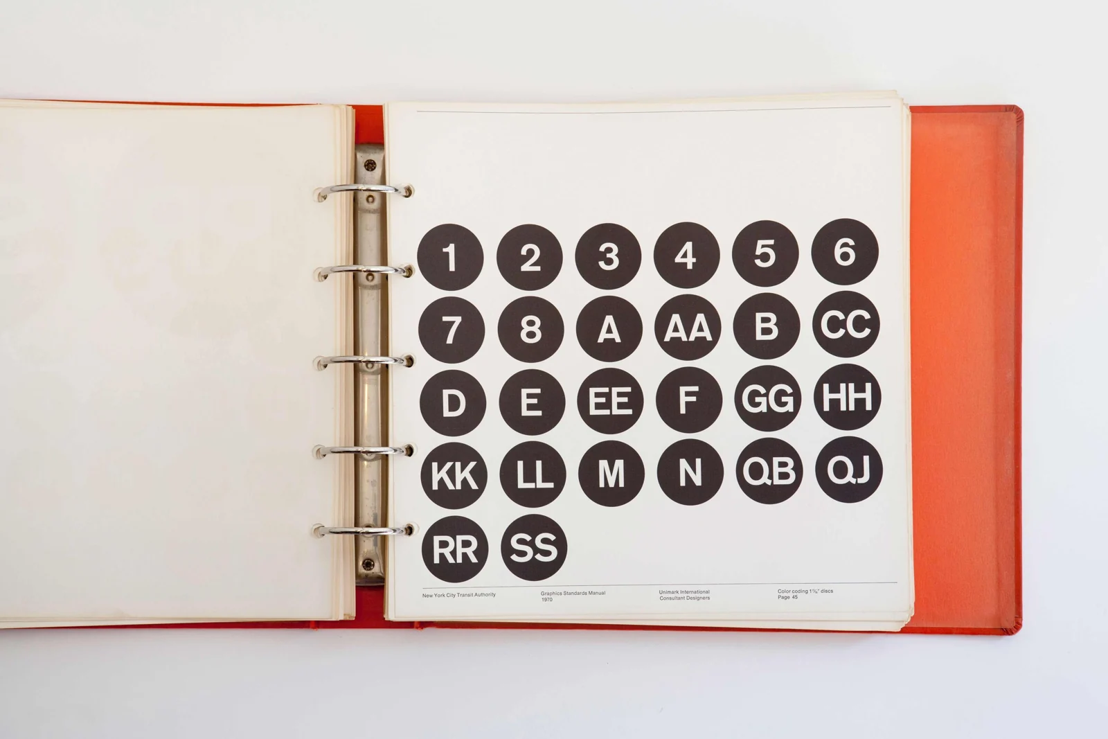
New York’s subway was unified under city control in 1940, but inherited signs from different operators and periods. Unimark began the effort to standardise wayfinding in the 1960s. The 1970 NYCTA Graphics Standards Manual, designed by Massimo Vignelli and Bob Noorda, set out how signs should be designed and constructed.
The value of a manual like this is easy to underestimate. The network keeps changing. A new destination, a different service combination, another entrance: each produces a fresh design problem. The original designers cannot stand beside every person solving it.
The manual makes their reasoning portable. It gives future decisions a shared starting point. That is what I would want from any identity expected to work across teams, venues, and years.
Show the procedure, not only the perfect example
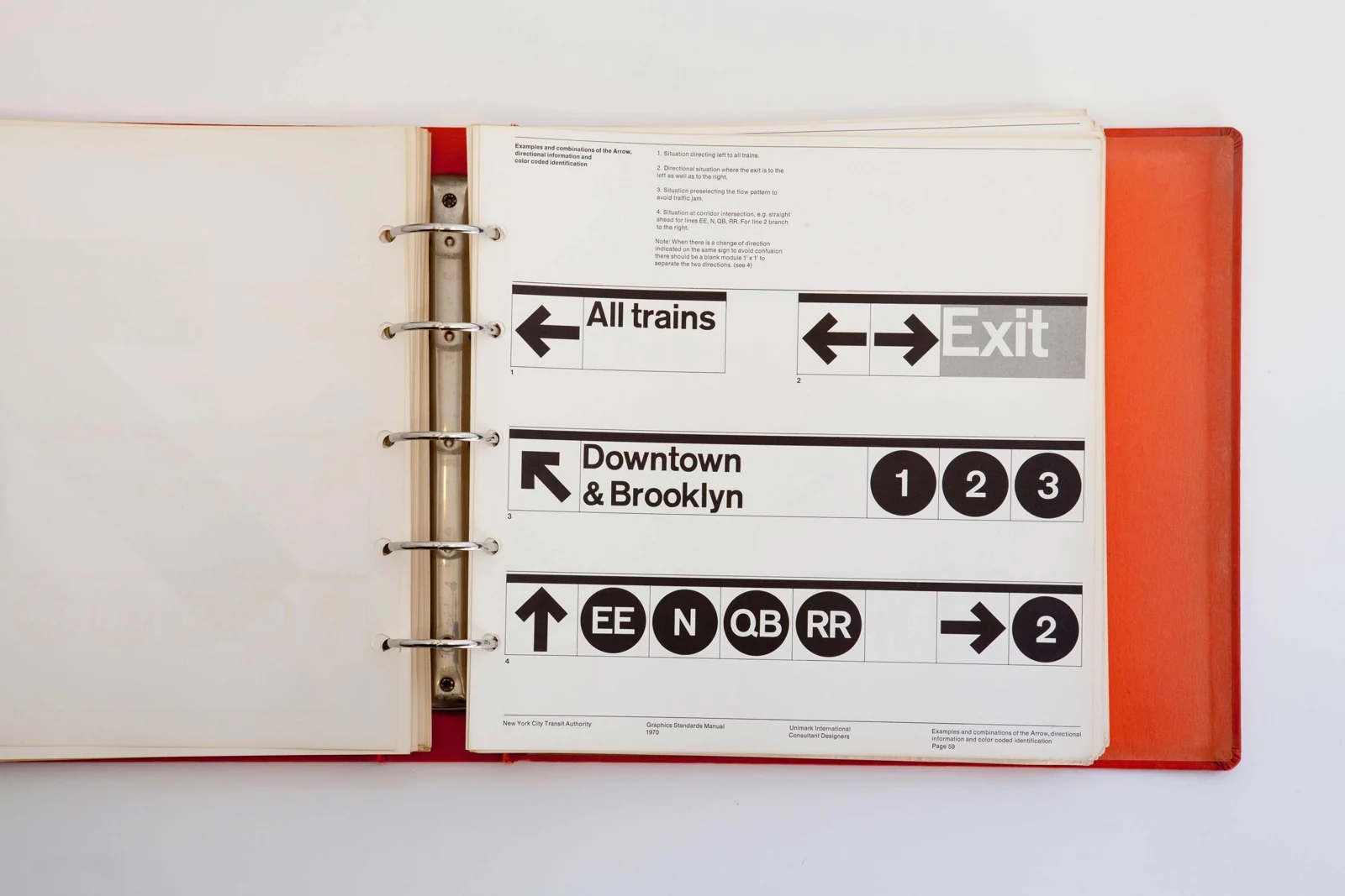
A finished sign demonstrates one answer. A procedure explains how to reach another. The manual deals with type, arrows, route markers, spacing, and construction because the message alone cannot determine the result. The relationships need to remain intelligible as the content changes.
Brand guidelines often spend a lot of space on what elements look like and much less on how to make decisions with them. A page of approved posters can be helpful. But what should a designer do when a title is twice as long, the partner list has doubled, or the format is narrow enough to break the approved layout?
I would put a worked decision beside the polished example. Start with the incoming content. Show what deserves priority, how the elements are grouped, and what changes when the available space shrinks. Explain the reason for the choice. A person who understands the reason has a better chance of handling the exception.
Coherence still has to answer to the task
The separate subway map introduced in 1972 makes the case more interesting. Unimark’s diagram straightened routes and reduced geographical detail. It was replaced by a more geographically based map in 1979, following years of revisions and debate. The signage manual and the map are related work, but they are not the same deliverable.
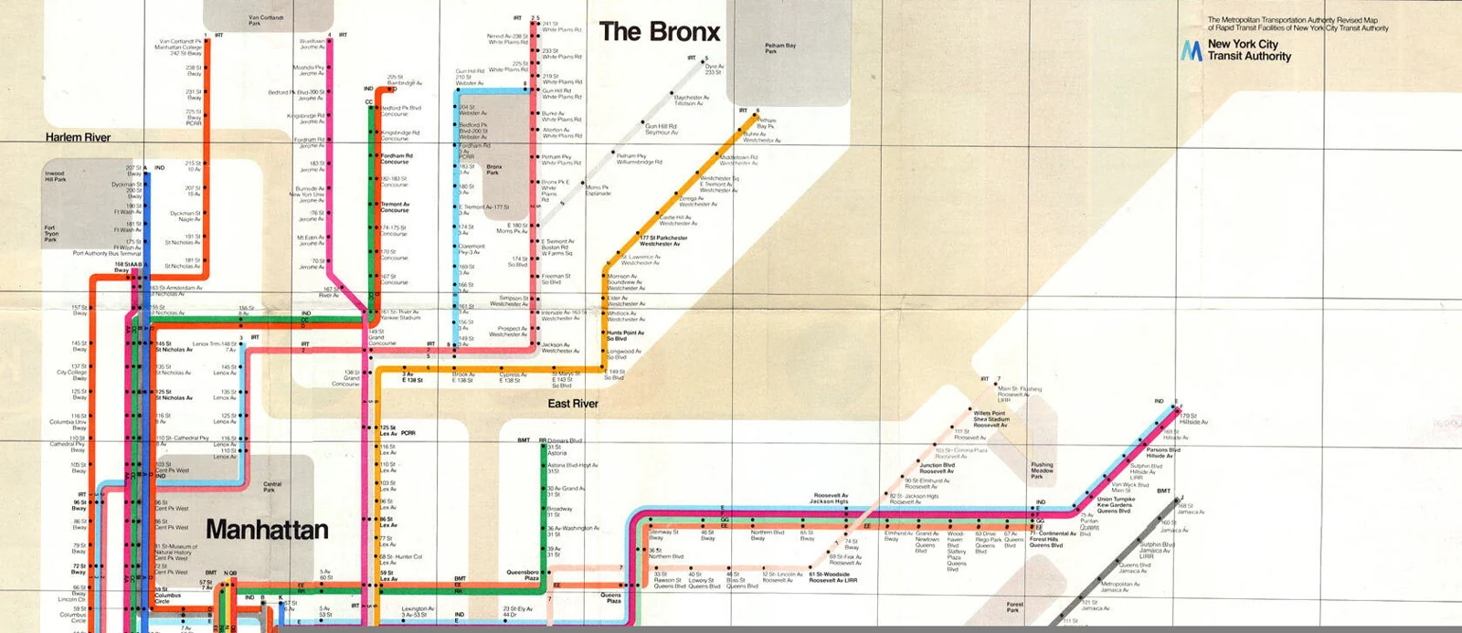
The lesson I take from that history is a limit on abstraction. A coherent visual system can clarify one task while making another harder. Understanding a route connection and orienting yourself to the street above are different demands. Simplification has to account for the information each demands.
This matters beyond transport. A festival website can look beautifully consistent while hiding which events require booking. An exhibition guide can give every work equal typographic treatment while making the route through the building difficult to follow. A clear style does not automatically produce a clear experience.
Test the handoff before you call it finished
Give the system to someone who did not design it. Ask them to make an application that was not in the presentation. Stay available, but do not guide their choices. Every question they ask is useful evidence. So is every mistake they do not know they have made.
If the result fails, look at where the failure occurred. Was the source content unclear? Was the rule missing? Was the example misleading? Was the tool too difficult to use? These are different problems. Another template will not necessarily solve them.
For a cultural organisation, a good handoff exercise might be a bilingual event card with a long title, an unfamiliar partner, and a changed venue. It is a plausible day at work. That makes it a better test than another immaculate launch poster.
Put it to work
- Can the next person find the correct assets and instructions?
- Can they explain the information hierarchy in their own words?
- Can they adapt the composition when the content no longer fits?
- Can an unfamiliar reader use the result without an explanation?
Give the system somewhere to learn
A manual should have a way to receive the problems encountered in use. Otherwise the team accumulates unofficial workarounds, and the official document becomes a record of a world that no longer exists.
Name the person who can approve an exception. Keep a short record of why it was necessary. When the same exception happens repeatedly, review the rule. This allows the system to develop without making every departure invisible or every correction a redesign.
The original designer’s absence is inevitable. The absence of a useful decision process is a choice.
A useful system carries judgement forward. You should be able to leave the room and still trust what happens next.
Sources & credits
NYCTA Graphics Standards Manual: Massimo Vignelli and Bob Noorda, Unimark, 1970. Manual imagery: NYCTA, published by Standards Manual. The separate 1972 map involved the wider Unimark team, including Joan Charysyn.
- The 1970 manual specifies relationships that can be repeated in new signs.NYCTA / Unimark; scan published by Standards Manual
- The information system in use at 14 Street.Photograph: Daniel Wright / The Beauty of Transport
- Different messages, related compositions. The next sign is part of the brief.NYCTA / Unimark; scan published by Standards Manual
- The 1972 map separates route connections from the city’s exact geography.Unimark / NYCTA, 1972; image via Ilya Birman
- A defined vocabulary for new route combinations.NYCTA / Unimark; scan published by Standards Manual